Adding crosshatch patterns to ggplot2 maps
I make a lot of maps in my day job – both as a data exploration tool and as a way to communicate geographic patterns – and one of the things that I’ve run up against is that there’s no easy way (that I can tell) to add overlay patterns in ggplot2. It seems like there may be some technical reasons behind this (see here, and here), but I also think patterns are sometimes frowned upon as an aesthetic in a way that I’m not convinced is warranted. In particular, I think crosshatching or stripes can be a nice way to set apart data that is qualitatively different in some way from the data that surround it; in my case, I’m often looking for a way to distinguish data that are estimated (from a regression model, for example) vs. data that are “real.” I’d found some workarounds online (including some using different mapping functions), but I really wanted to come up with a solution that worked within ggplot2 – and since I couldn’t find exactly what I was looking for, I thought I would code it up myself. I think the way I ended up solving it is interesting (although I’m 100% sure there are easier ways), so I’m documenting it here; because some of you may just want the solution though, here’s the too-long-didn’t-read version about how to use the code:
TL;DR: How to add crosshatching or stripes to your ggplot map
You can add crosshatching, vertical, or horizontal lines to your map using a combination of the draw.crosshatch() function, which I’ve made publically available here, and geom_segment(), which is the ggplot2 function that actually draws the lines. All that draw.crosshatch() requires is a shapefile dataframe that looks like this:
library(fiftystater)
library(tidyverse)
data("fifty_states")
head(fifty_states)
## long lat order hole piece id group
## 1 -85.07007 31.98070 1 FALSE 1 alabama Alabama.1
## 2 -85.11515 31.90742 2 FALSE 1 alabama Alabama.1
## 3 -85.13557 31.85488 3 FALSE 1 alabama Alabama.1
## 4 -85.13156 31.78381 4 FALSE 1 alabama Alabama.1
## 5 -85.13017 31.77885 5 FALSE 1 alabama Alabama.1
## 6 -85.11529 31.73157 6 FALSE 1 alabama Alabama.1The dataframe has 3 variables in particular that we’re interested in: long, lat, and order. These are the variables that most shapefile dataframes will come with, but they do have to be named with those specific variable names for the function to work. We’ll also need the variable that defines the specific geographic unit – in this case, group, which defines distinct shapefiles within the state (islands, for example).
You then need a list of states (or countries, or whatever your geographic unit) that you want to overlay a pattern on. Usually you’ll want to grab these based on a variable from an actual dataset, but in this case for simplicity, I’m just going to manually create a character vector of a few state names. I’m also going to generate some random data to plot.
# List estimated states
estimatedstates <- c("michigan", "texas", "new york", "california")

# Generate random data
fakedata <- as.data.frame(cbind(state.name, runif(50, min=0, max=100)))

# Make state names lower case (to match fifty_states)
fakedata <- mutate(fakedata, state.name = tolower(state.name), fillvar = as.numeric(V2))
draw.crosshatch() needs to be applied to each distinct shapefile within our estimated states; luckily, this is easy to do by creating a list of dataframes (one for each group) using nest(), and then applying the function to each using map_df (thank you purr package!). The result is a dataframe that contains the start and end points of each line that will define the pattern on our map.
# Load function
source("https://raw.githubusercontent.com/imaddowzimet/drawcrosshatch/master/draw_crosshatch.R")

# Create nested dataframe of just estimated states
fifty_states_estimated <- fifty_states %>%
  filter(id %in% estimatedstates) %>%
  group_by(group) %>% nest()

# Create dataframe of lines
lines <- map_df(fifty_states_estimated$data, draw.crosshatch, width = .5, pattern= "crosshatch")
The only other arguments you need to worry about are “width”, which defines how close the lines will be together (in degrees), and “pattern”, which can be either “vertical”, “horizontal” or “crosshatch”.
Finally, I can plot! The only difference from a “normal” ggplot map is that I’m adding a geom_segment() option, which I’m feeding the lines dataframe to. The rest is just extra formatting.
# Actual plot (notice that the only difference from a "normal" map is the geom_segment() statement)
p <- ggplot(fakedata, aes(map_id = state.name)) +
       geom_map(aes(fill = fillvar), color="black", map = fifty_states) +
       expand_limits(x = fifty_states$long, y = fifty_states$lat)  +
       coord_map() +
       geom_segment(data=lines, aes(x= x, y = y , xend = xend, yend = yend),
                    inherit.aes = F)

# Adding some formatting
lowblue <- rgb(red=91, green=137, blue=168, max=255)
highorange <- rgb(red=216, green=70, blue=33, max=255)
p <-    p +
        scale_x_continuous(breaks = NULL) +
        scale_y_continuous(breaks = NULL) +
        labs(x = "", y = "") +
        scale_fill_gradient2(low=lowblue, mid="white", high=highorange, na.value = "gray50",
                             breaks = c(round(min(fakedata$fillvar)),
                                        round(mean(fakedata$fillvar, na.rm=TRUE)),
                                        round(max(fakedata$fillvar))),
                             midpoint=mean(fakedata$fillvar, na.rm=TRUE)) +
        theme(legend.position = "right",
              panel.background = element_blank(),
              plot.title = element_text(hjust = 0.5, size=12, family="Palatino Linotype"),
              plot.caption = element_text(face="italic", hjust=0)) +
        guides(fill = guide_colorbar(barwidth = 0.7, barheight = 5, title=NULL, tick=FALSE)) +
        ggtitle("Some super interesting variable by state, 2014") +
        labs(caption = "Note: states with crosshatch patterns denote estimated data")
p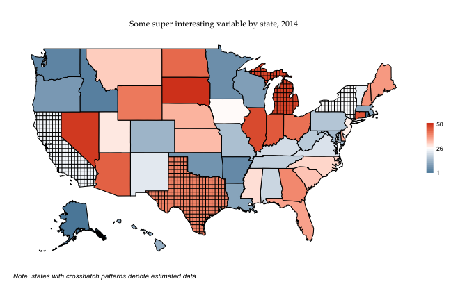
If I wanted to do vertical lines instead of crosshatching, I’d just rerun map_df with the “vertical” argument specified, and then call the same graph (the graph code is the same, so I’m not respecifying it here).
lines <- map_df(fifty_states_estimated$data, draw.crosshatch, width = .5, pattern= "vertical")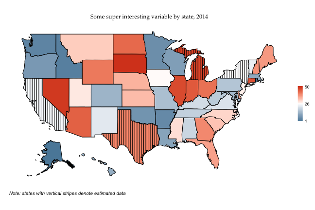
And just for completeness, horizontal stripes:
lines <- map_df(fifty_states_estimated$data, draw.crosshatch, width = .5, pattern= "horizontal")
Magnets how does it work?
Here’s what I think is the interesting bit, which is how draw.crosshatch() actually works. I had to spend quite a while figuring out generic enough rules that it could find the start and end points of each line reliably, without getting tripped up by the weird shapes that geographic areas come in (oh why oh why couldn’t countries and states just all be squares. Looking approvingly at you, Wyoming, and shaking my head at you, Michigan). Laying these rules out will also give you an idea of why it fails when it fails (and it does sometimes, definitely, though usually not too dramatically), and how it could possible be improved on. It’s also worth mentioning that the full draw.crosshatch() function is of course available on github, and is really the authoritative version of what it’s doing; what I’ve written below is really trying to just give a more conceptual idea of the approach.
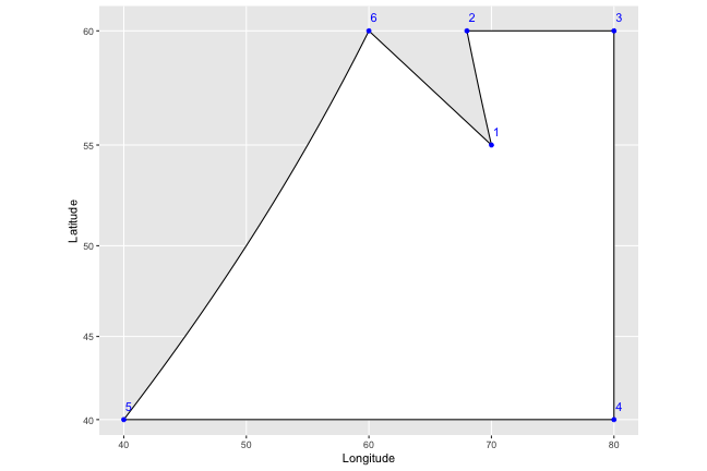
To help lay it out, I’m going to come up with a fake country, Isaacland, and give it absurdly simplified borders.
# Define latitude and longitute, then create variables for region and order
long <- c(70, 68, 80, 80, 40, 60)
lat <- c(55, 60, 60, 40, 40, 60 )
Isaacland <- as.data.frame(cbind(long, lat)) %>%
            mutate(order = row_number(), region = "regionMZ")
Isaacland
## long lat order region
## 1 70 55 1 regionMZ
## 2 68 60 2 regionMZ
## 3 80 60 3 regionMZ
## 4 80 40 4 regionMZ
## 5 40 40 5 regionMZ
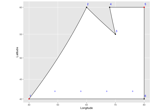
## 6 60 60 6 regionMZWe end up with a dataframe that should look familiar – it has the points that define the shape of the utopia that is Isaacland, and specifies the order in which they should be connected. When we connect the dots (which I’ve colored blue, and labelled with their order), the country looks like this:
What the draw.crosshatch() function first does is find the leftmost and rightmost points on the map. These are marked in red in the graph below:

If there’s a tie, it just picks the first one in the order; we don’t actually care about the actual points here, but just want to find the rightmost and leftmost longitude.
Now we want to find the horizontal placement of the vertical lines we’ll draw - we do that by just counting off from the leftmost to the rightmost point, by whatever width was set in the function (let’s say 9, for this example, though that would be extremely wide). I’ve marked these on the graph as blue plus symbols:

So to draw our vertical lines, we know that all we need to do is draw lines straight through the plus symbols. The problem is that we have no idea where they should start and stop; if we drew lines right now, they would extend past the borders of our shape on to infinity, and even if we bounded them at the highest and lowest latitude of our shape, they would still go too far in several places:
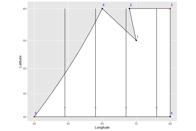
That…doesn’t look too good. What we want is to find the top and bottom latitudes of the shape border where the particular line is being drawn. So this is what we do instead:
1) We first renumber the points so that they start at the leftmost point - later on, this makes things much easier, since we don’t have to worry about the ordering suddenly starting over before we get to the end of the shape.
2) We then start at the first plus sign, and look for the point first in the order that has a longitude greater than the longitude of our plus sign (i.e. that’s to the right of it and on the top of the shape). In this case, the first plus sign has a longitude of 49, and point number 2 (circled in green below) is the closest to it on the right side. Note that even if there was a 7th point at (50,40) – marked in dark red below on the bottom edge of the shape – we’d still correctly pick point number 2, because it has an earlier order number (you can see why renumbering makes things easier).
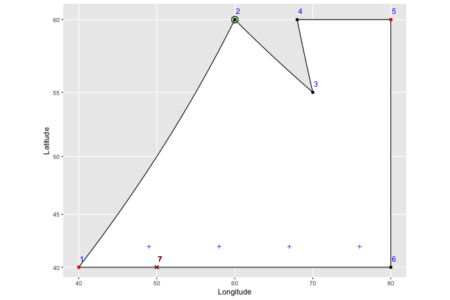
3) We then pick the point immediately before number 2 in the order (number 1, in this case), and find the slope of the line that connects them (in this case, the slope = (y2-y1)/(x2-x1) = (60-40)/(60-40) = 1.) From there, we can easily find the point where a vertical line drawn through the plus symbol should end: y1 + (x1-xplus)*slope = 40 + (49-40)(1) = 49.
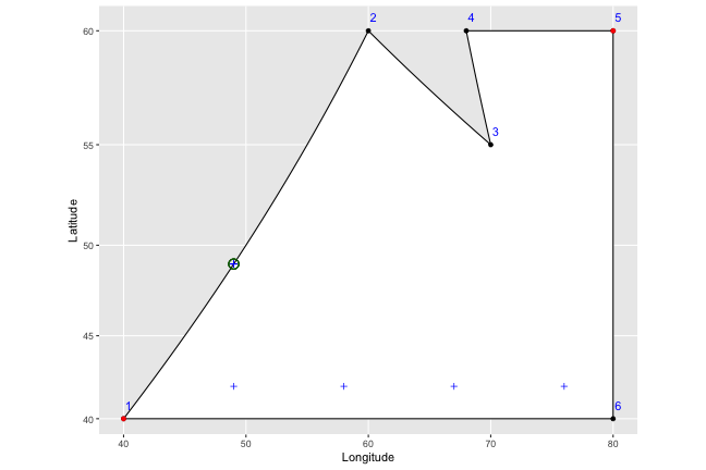
We go ahead and do that for each of our plus symbols:
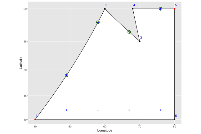
And then to find the bottom points, we just do the same thing in reverse; reordering the points to start from our right most point (in this case 5), and working our way left instead of right. We end up with nice vertical stripes.
lines <- draw.crosshatch(Isaacland, width = 9, pattern="vertical")
ggplot(Isaacland, aes(map_id = region)) +
       geom_map(color="black", fill = "white", map = Isaacland) +
       expand_limits(x = Isaacland$long, y = Isaacland$lat)  +
       coord_map() +
       geom_point(x=Isaacland$long, y = Isaacland$lat, color="blue") +
       xlab("Longitude") + ylab("Latitude") +
       geom_segment(data=lines, aes(x= x, y = y , xend = xend, yend = yend),
                    inherit.aes = F)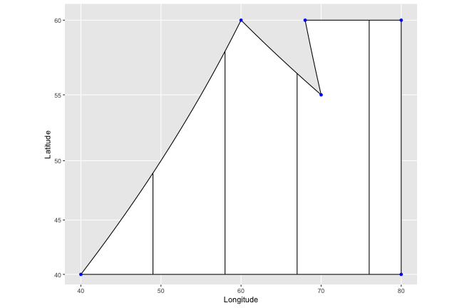
We do something similar for horizontal stripes (starting with the top and bottom points, instead, of the left and right ones), and do both for crosshatching. Actually, if you try this out yourself with horizontal stripes (or use your imagination), you’ll actually see where the code breaks down a bit; 5,000 points for anyone who manages to figure out how to get around this problem.
